Aesthetically, I think Lunacy is very attractive but there is one glaring exception…
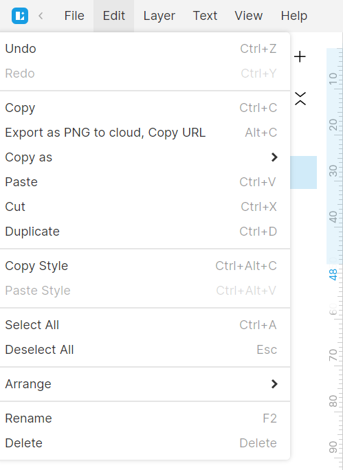
… Why aren’t the menus left-justified with the menu titles? I’ve always found this quite jarring, not just aesthetically, but also from a usability standpoint. I think the intent was to have the menus center-justified with the menu titles (a very odd and not very good choice IMO) as this appears to be the case with the Layer, Text, View, and Help menus. However, center justification is not possible with the File and Edit menus (see pic) and thus inconsistent justification exists between the various menus.
I can’t see any reason why this design choice was made and would greatly prefer the menus to be left-justified with the menu titles as is the case with almost every other app.
**Lunacy 9.2.1
**Windows 11 Pro 22H2